University of Michigan.
Overview.
Project Management | Team Management | UX Design
The Alumni Association of the University of Michigan (AAUM) engages the 600,000+ living alumni of the university through a variety of online and offline programs. One of its premier offerings and top sources of revenue is its memberships, which supports AAUM programs such as LEAD, a merit-based scholarship program for underrepresented students at the University of Michigan.
Role:
Director, Product Management & User Experience | Project Manager, UX Designer
Location:
Ann Arbor, MI
Project Period:
Dec 2020 - Feb 2021
UX Tools Used:
Canva | Google Analytics | Pen & Pad | WordPress
Credits:
Web Development: Carrington May
Problem.
Original purchase journey.
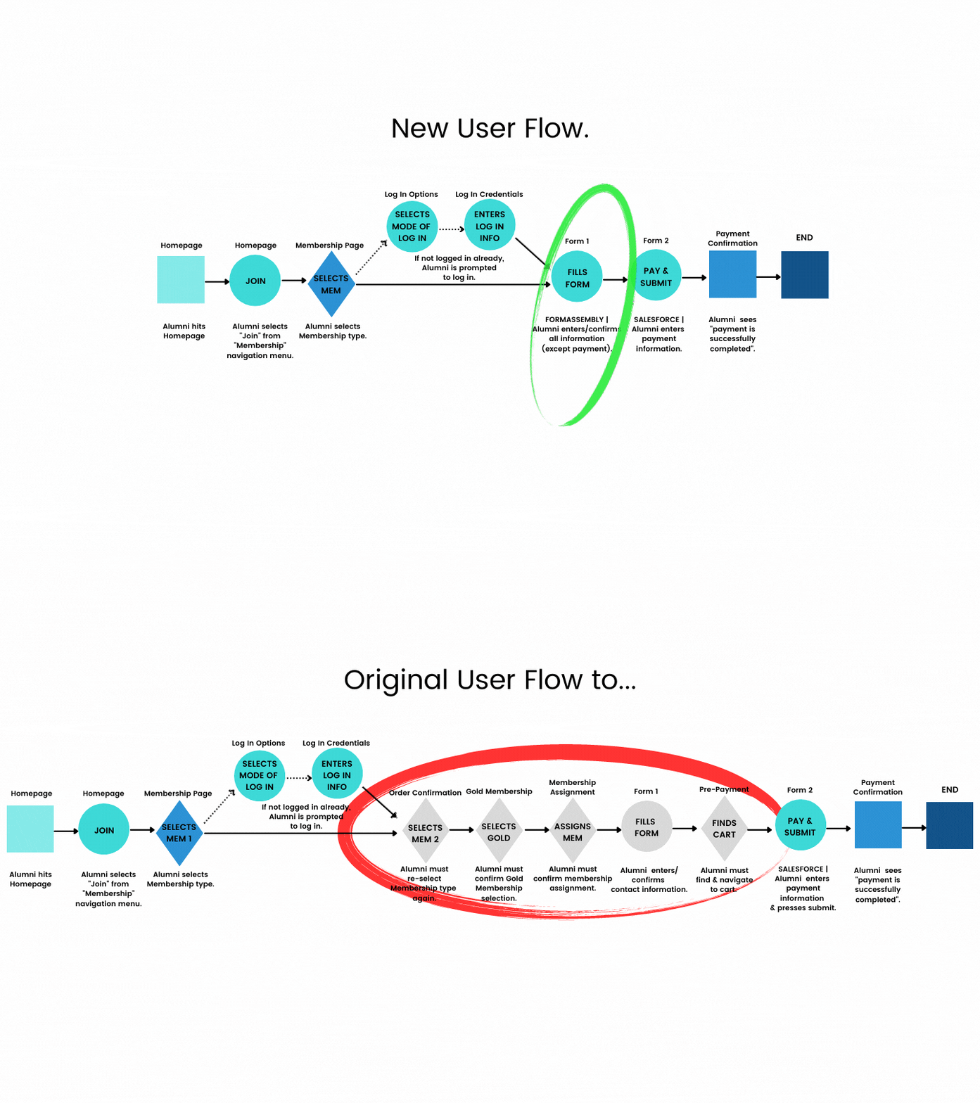
Despite membership’s importance to AAUM’s success, the membership purchase journey was confusing, outdated and slow. To purchase a membership, alumni (users) were required to navigate 11 clicks, 8 steps, 8 loading periods, 6 pages and more.
As a result, this project’s objectives were to:
Reduce the time and actions (clicks, steps, pages, etc.) required to purchase a membership, promoting purchase conversions and reducing the number of abandoned carts.
Showcase a clean, modern purchase experience that demonstrates the importance of membership to AAUM.
Solution.
I led a cross functional team of 14 people from AAUM’s Technology, Membership, Alumni Relations, Data and User Experience/Product Management teams. Together, we designed a new purchase journey that cut user interactions by 56% and ~1 minute.
Original purchase journey.
New purchase journey.
Process.
Design.
Successful purchase journeys utilize UX best practices that users encounter elsewhere in the digital space. This familiarity reduces user’s cognitive load, allowing them to navigate the purchase process intuitively and seamlessly. | UX Best Practice: Jakob’s Law
To achieve an intuitive and seamless purchase journey, I applied a number of UX best practices. Here are some of them:
Reduce User Choices, Reduce User Time: To reduce choices required of users, we used FormAssembly to streamline and eliminate 5 steps in the purchase journey (see highlighted area in the original user flow below). We also employed conditional logic and auto-fill with user’s personal information already stored in our database. | UX Best Practice: Hick’s Law

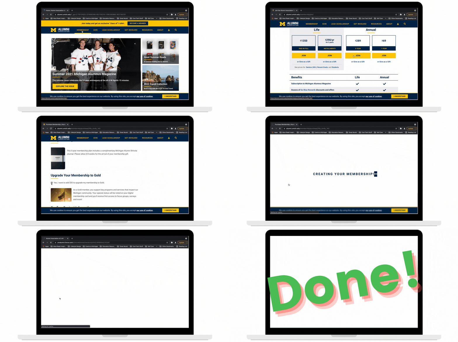
Delight & Assure the User: Due to constraints with Salesforce, loading periods could only be reduced, not completely eliminated. My workaround? Animations – simple and engaging visuals introduced during the loading periods to infuse the user experience with fun, as well as assure users that they are not waiting in vain.
Deliver Appealing & Cohesive Design: To communicate ease of use and quality to users, we replicated the overall UI design of the the university website. Not only does this provide visual appeal to the user, but it signals brand cohesion and usability. | UX Best Practice: Aesthetic Usability Effect
Group Related Sections: I introduced labels and design elements to differentiate each section of the purchase journey. This produces a pattern that reduces cognitive load, allowing users to more quickly interpret and engage with information. | UX Best Practice: Law of Common Region & Gestalt Principles
Use Single Columns: I introduced single, vertical columns in forms. This can reduce user effort, confusion, errors and time. | UX Best Practice: Research by Google and others
Provide Clear Calls to Action & Social Proof: I provided personalized calls to action throughout the purchase journey (e.g. the submit button is “Buy My Membership!”) and indicated that over 100,000 Wolverines have also purchased memberships towards the beginning of the journey. | UX best practices, respectively: Users want to know why they should do something from a personal standpoint, Call To Action (CTA), and are influenced by evidence that others are doing it as well, Social Proof.
Go from Easy to Hard: I began the purchase journey with the easiest tasks building to the more labor-intensive tasks towards the end. | UX best practice: User flows that begin with easier items facilitate User Streaks, momentum that helps compel users to complete the process, even as more difficult items appear.
Build.
Once UX and UI design were in place, we pivoted to build out functionality with the support of the Technology team. This was the most labor-intensive phase, as it required:
Technical integration across 3 systems – FormAssembly, Salesforce, and WordPress.
Development of strategies to address the subsequent issues that arose within and across these 3 systems.
Test.
With the design and build phases complete, we pivoted to testing. To ensure a high-quality user experience for our alumni, testing was:
Conducted by alumni and 4 internal teams (Technology, Alumni Relations, Membership, and my User Experience/Product team).
Done across devices and browsers used by 90%+ of our alumni.
This comprehensive approach to testing allowed us to leverage the expertise of a number of stakeholders across the organization, which provided a holistic view of our alumni’s user experience.
All testers followed a prescribed testing script that I created, adding their feedback:
Iterate & Ship.
Once testing was completed, all stakeholder feedback was collected and prioritized using a simple prioritization method:
P0 = Critical - cannot ship before this is addressed.
P1 = Important - but will not stop release.
P2 = Nice to have - for future iterations.
Results.
A 56% reduction (on average) in user interactions in the purchase journey (clicks, steps, loading periods, pages, and pop-ups). (See chart.)
Elimination of ~1 minute (at least 50%) from the purchase journey.
A more streamlined and intuitive purchase process that incorporates usability standards and best practices for online purchasing.
To be determined: Conversion and revenue impact. (More below in SWOT Analysis.)

Demo.
Original purchase journey.
New purchase journey.
SWOT Analysis.
I led a post mortem/debrief meeting with key stakeholders to review lessons and insights from this project. The result was actionable items that would help facilitate even more successful collaborations in the future.
Key takeaways are represented in the following SWOT Analysis:


